Monday, 19 September 2011

Development of Film Posters

Over the last 10 years, the film poster has changed in a number of different ways. Mainly because of the increasing development of technology. It now means that posters are now having to become more visual to grab the attention of their target audience. This is because the use of the internet has changed and with films becoming more easily accessible through the use of itunes, Youtube and other downloading/film sites. Another reason is because people do not watch as much television or listen to the radio as much as they used to. Again, this is down to technology. More and more people are using social networking sites, such as Twitter, MySpace, Tumblr etc. It means that a new way of mainstream film promotion is going to be through the use of the social networking sites. So in terms of film posters, they are now having to become either more visually effective and in some cases quite straight to the point. But also trying to leave the audience with a possible idea as to what the film could be about. Which could help to generate a Word Of Mouth. One example the change in film posters in the development of the Sci-Fi film, Tron Legacy (released in 2010).


Tron Legacy Poster 2011


Tron Poster 1982


Both posters have the same iconic image, although the Tron Legacy version is more close-up. This is to show to the audience that there is going to be new characters. This also shows that the film is not going to be a re-make of the 1982 original. This is also shown through the name of the film. The 2010 film is called Tron Legacy. This suggests that the film is possible going to be another chapter added to the original film, as the word Legacy means something that has been handed down through the generations. Therefore it could suggest something about the characters and their roles within the film.

In comparison, to the 1982 poster, the Tron Legacy poster is more visual. This shows the change in technology.  Although, the fact that the 1982 poster has no background except for the 3 round circles that the two silhouettes appear to be standing on. It can be said that this is more effective as it immediately puts forward the 2 main characters. Although the audience have no more information about them. Another thing that differs the 2 posters from each other is the fact that the Tron Legacy poster does not have a Tagline. I think this is because it doesn't need one. The poster is already quite visual enough so I think that adding a Tagline would make the poster look too full/cluttered. The background of the Tron Legacy poster shows a few settings in the film. I think they have been added to try and attract the different audiences. The people who remember watching the film in 1982 and a new younger audience. The background would attract the older audience because the images can be used to show them how the difference in technology has changed the iconic settings. Whereas the younger audience can be attracted by the effects and use of color.

So in some ways the difference in technology has effected the change of the poster visually but also because of the fact that the Tron Legacy poster would not only be appealing to an younger audience but also an older audience so that they can experience a different way of the film. 

Friday, 16 September 2011

Film Poster Research- The Fifth Element

Fifth Element Film Poster

The Fifth Elment is a 1997 Sci-Fi about a man called Korben Dallas and his travels with extra-terrestial being, Leeloo to save the world from being crushed by a astorid. The films stars Gary Oldman, Milla Jovovich, Chris Tucker and Bruce Willis.

This film poster is very different to the Sci-Fi films that we see today. This is because the technology was not as advanced as it is now. The poster is quite packed and technically is quite full. The background image immediately gives away the fact that the film is going to either be set in or involve space. Which tells the audience that the film is going to be a Sci-Fi. The use of the stars in the background helps to make the foreground images stand out more. The use of the 5 planes/spaceships heading towards the beams of light suggest that there could some sort of race-to-the-finish type thing. With the three main characters at the top of the page and Bruce Willis' in the front shows that he is the main progtaganist that the film will be based around. The fact that the beams all rise to the Gary Oldman and Milla Jovovich suggest that they may all be connected to each other and the story in some way. The billing block is quite unusual as normally on today's posters, the billing block would be a dark Grey. Whereas in this poster, they're White. It's effective and useful because then the audience are not only focusing on the top half of the poster but also at the bottom half so it means that they'll get a better overview of the poster.

Again, in this poster the font, is quite simple and uses a plain colour as well. If it had used any other colour, it wouldn't have worked. The font is quite small because of the amount of stuff that has been added to the poster and a bigger font would have made the poster look even more packed. However, the small ball of light cuts off the top half off the font letters of the film's title so makes it a little strange but strangely, it works. The tagline 'There's no future without it' gives just that little more information about the film as it suggest that the film is going to contain a race against time or something to do with death. Also it can possibly give an idea as to when the film is set, the spaceships and the astorid suggest that the film has a futuristic element to it.

Film Poster Research-Memoirs Of A Geisha

Memoirs of a Geisha Poster

Memoirs Of A Geisha is a 2005 historical period drama. The films stars Zhang Ziyi, Ken Watanabe and Michelle Yeoh and focuses on the life of Chiyo Sakamoto how she became one of the most famous Geisha in all of China. The poster is very simple but yet uses very effective techniques.

The first notable fact is that the poster's background is of Zhang Ziyi, so we immediately assume it is going to be focused around her. This is effective as it means that less concern is taken with what else needs to be put on the poster to make it more eye-catching. Another thing is miminal use of colour within the poster. The use of White and Red make Zhang's face a lot more vibrant and thus would make the poster more visbale from afar. The use of the contrast in colour with the title is effective, however, becuase of Zhang's hair takes up the edge of the poster, it make it harder to see the rest of the title and the film's release date. The title font is strange becuase the word 'Geisha' is in bold White and the rest of the title is in red. It's trying to say the word is the most important part of the poster. It is effective although, the word 'Geisha' is bigger than the rest of the title, it may confuse people into thinking that she may be modelling for make-up. T he film's release date is barely visable, which means that it's left down to people to possibly go and research when the film is released or it invites people to look at it on a closer glance. By contrasting the title with her make-up, it gives the audience an idea as to what the film is about and the time it may be set. Geisha were around in Japan in the late 18th century. 

The idea that I can take from this is that, using one unique image is eaiser when it comes to creating a film poster as it is more effective as it means that it would be more eye-catching to anyone who looks at this poster. However, the problem would be trying to find the best picture that would advertise the film as best as it could. Using less colours on a film poster may be more simple, instead of using Red, Green or any other bright colours, the simpler the font and colour is, the more effective it makes a poster. Although it means you have to find a plain background or a simple picture for the font to stand out on. In some ways, the more simpler your film poster is, the more complicated it can become because then you have to find the right image and font and colour for it all to work otherwise, as can be seen with the use of the red font colour, it may not always work properly.

Thursday, 15 September 2011

Purpose of Short Films

The most common reasons for creating short films are self-promotion and experimentation. They can be seen as a baby step into film production because it's all about finding different ways of expressing themes and communicating a message within different techniques. Whether it's sound, Mise-En-Scene or the cinematography.


Gravity is a clear example of this as the use of the 180 degree tilt used in the film after the gun shot goes off, makes the audience feel as if they've been turned around.
180 degree tilt


Although the shot is used to change thre setting of the scene. Another example is with the digetic sound, the beginning and the end of the film uses a squeaky swing which is an audio-visual reference. However at the end of the film, the sound of the swing becomes more rusty to change the atmosphere of the film and it makes it a little uncomfortable to watch. The film can be seen as a trigger film, in the sense that it acknowloedges the theme of gun crime within urban areas. Also how what may be harmless fun can actually harm someone/something else. It may have been entered for film festivals and competitions but has possibly been mainly used to educate school kids from year 10 upwards in assemblies and PSCHE classes. Short films are an easier way of highlightinh crime and issues that are not normally addressed in class or on the news.

They can also be used as a way of understanding new Media technology when it comes to filming with new cameras or editing with new software. It can be used to enhance the knowledge of technology and seen as an experiment with different shots, editing techniques and post-production to find ways of communicating a message. While challenging the normal convetions of filming a short film. Also they're mainly funded by the local film production companies like the UK Film Council or BBC Films.


Wednesday, 14 September 2011

Audiences Of Short Film

The aim for short film relates tends to relate to the purpose if short film. One of the main  reasons is for self-promotion. Therefore, the film is aimed at people who go to film festivals and competitions or even talent scouts. As short films are typically used as experimentations for aspiring and established film directors, the audiences would not be as wide as a feature length film. An example of this would be Cherries by Tom Harper. The 15 minute film was about a class of 16 year olds who were being called to the front line. The film would have been shown in schools from year 10 upwards on the issue of a dictatorship and the subject of human rights.

Where a flim like Sign Langauage with it's chirpy and light-hearted atmospehere, was filmed as a dedication to all those people we do not notice whilst out and about. But that main reason is fo self-promotion as it won an award in the Virgin Short Film festival.

However, short films are not always used for self-promotion. Alive In Joburg and Double Take are clear examples. Alive in Joburg, directed by Neil Blokamp, was an experimental short film that was a basic idea for the well-known film, Distirct 9. Neil used clips from the local news channel to create a frustatraion against aliens who were living in the outskirts of the country. After Neil then went on to go to direct District 9 which did very well. It shows that as well as expermienting, short films can be used for a number of different reasons. Although they may be typically used for self-promotion and expermientation. They can be used for informing audiences as was Alive In Joburg. Another example would be Malhuer, a  6 minute French animation, filmed completely with Lego, is also in a way like Alive In Joburg, in the sense that both directors use each film to create a different way of telling a story to an audience. Although Neil Blokamp's film is used as a way to pitch a film idea, Jeremy Richard, the director of the Malhuer, created his film as a way to technially think of an idea of creating a story.


Tuesday, 13 September 2011

Potential Audiences

What are Potential Audiences for Films?


Over the last few years the creation of short films has increased this is because of technology which has enabled many people to create films in short amount of time.


There are different ways in how short films are funded. One of the ways they are funded is by the UK Film council however from the 1st April due to funding cuts from the government this was transferred to the British Film Institute (BFI) and Film London. In one year they were able to invest in £15 million for the production of films. As well as funding the UK Film Council distributed and exhibited short films, this would make it easier to reach the audiences.


Short films are not profit- oriented; they are mainly created for the self-promotion of directors, to be entered in film festivals and competitions- they are like a ‘stepping stone’ and to gain experience. Some films are created for educational purposes therefore they are like ‘trigger films’ to communicate a message their audiences which would mainly be students. A film that was targeted at students was a film called cherries by Tom Harper and Gravity by Collin Hutton. These films are normally about young adults- some children, for example the short film Gravity was young people committing crimes and there was a clear message of ‘the responsibility of actions’.Different films are directed to different audiences such as the film ‘Sign Language’ by Oscar Sharp would have a target audience of a wide range because of the content. A film like memories by Radoslaw Sienski would be targeted 25/30+.


Memories- Radoslaw Sienski


The target audience would effect the content in the film. For example, 'Trigger Films' are normally targeted at Teenagers and school kids. This is because they normally discuss these films as they have important messages which is the film would initially be created for. An example of a Trigger film is Gravity by Collin Hutton. It is about young teenagers/ kids who need to take responsibility for their actions. In this short film the kids fire a gunshot in the air which at the end is revealed that they kill an innocent young child playing on a swing. This film would target upper school audiences because strong language and graphic and it would be suitable for year 7. Therefore Gravity would be more like to get a age certificate of 15.  
Gravity- Collin Hutton

Feature length films have more potential audiences because they have much more publicity, as the trailers/posters/adverts are shown in various locations such as on television, near cinemas, stations and bus stops the public becomes more aware of them compared to short films which are not normally as heard of. The main reason for this is the budget which is much less than main stream films, as short films are normally 5-10 minutes less money is needed to create them therefore there is also less publicity otherwise more would have to be spent on publicity compared to the actual film.

BBFC Logo Vector DownloadOther ways how short films are distributed is through the internet again with due to technology, people from all over the world are able to see short film with sites such as YouTube and the BBC Film Network (some films are also shown on the official websites of the director/creator) and this enables the creator to easily share their work as people of different ages visit these sites. However not many people do search for short films as they are not main stream as do not get as much publicity as feature length films. therefore it would not easily reach target audiences.
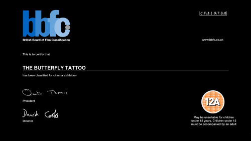
The British Board of Film Classification (BBFC) classifies all films in created in the UK. There are six categories where films can be classified into and there are ‘U’ which is suitable for all, ‘PG’- Parental Guidance, ’12’ and ‘12A’- Not suitable for children under the age of 12 however may see the film accompanied with an adult, ’15’, ‘18’ and ‘R18’. 

The reason for why films are classified is because of the content- some scenes may distrub/be harmful to different audiences. For example horror film may upset younger children making them unsuitable therefore there would be an age limit so the child must be atleast a particular age before they can watch the film. An example for this is Paranormal Activity 3 was rated 15 as it contained strong language and threats which would not suit anyone younger than this age.

Examples of Film Certificates by the BBFC:
The BBFC notes whether they are any scenes  which are harmful such as criminal activity or whether anyone was harmed during the production. If there is any detail regarding criminal activity then the BBFC can ask the owners the remove such scenes before a certificate is given and released to the public because these can influence people.  


Short Film Analysis- Bitch


Film: Bitch

Written and Directed by: Dom Bridges

Bitch is a short film approximately 4 minutes long. It is produced the banner of Future Shorts (and was distributed by them) and was made in 2009. It has a linear narrative structure and it is subjective and restricted to the main character (who is a man) because we find out about events along with him. There is an element of surprise because at the beginning we see a vulnerable lady whom we think mistakes someone for her child but in the end we see that she is the one who manipulates the bond between a mother and child to get her expensive shopping for free. The idea of a surprise element would be good to use in our film because it makes the audience remember the film.  

The score comes in at the beginning of the film during the titles and at the end credits. During the film there are only ambient sounds of people shopping and the dialogue on screen. This makes the audience focus on what is being said. The editing has mainly cross cutting between the old lady and the man. However the editing with the titles is quite effective.  Our film is also most likely to have simple editing because of the practical reasons such as the software we will be using.

The location is the supermarket where is shot throughout the film which again is mostly in short films because of the time constraints they cannot show characters moving around a lot.

The titles are effective and makes the film better in general in this film because they are created using products in a supermarket which goes with the theme of shopping as the main plot of the film is a man buying a tin of tuna. An example of this is, the title ‘Bitch’ is written on the washing powder and the director name ‘Dom Bridges’ is written on a box of dog food. The end credits are also effective because they are presented like a receipt as it says “Thank you for shopping with us” which could be interpreted with the meaning thank you for watching.

The theme of the film is deceit and the roles of normal characters have been challenged because normally it would be the man who would something like that (deceiving) and the old woman would be the victim however in this film the roles have been swapped- also known as role reversal.

There is a significance with the actors who play the roles of the character because it is obvious that the male cannot be the woman son and the photo does not match (as the man in the photo is Chinese). Therefore this is important in all films whether they are short or feature lengths that characters must be played with around the correct age. Such as in this film a young girl playing the role of the old lady would not work.

The good point about this film is it is quite experimental in terms of the plot because a feature length film about buying a tin of tuna would almost definitely not be a success with the audience because there wouldn’t be much of a story whereas in a short film it has worked with a very simple idea which has some humour and good techniques.