In what ways does your media products use, challenge forms and conventions of real media products?
The first way our media products challenege forms and conventions is by creating a poster to advertise our film, as it not something that is usually produced by independant film makers due to the reason they are made. Which, after reasearch, we found is mainly for competition entries, self promotion and/or experimental purposes. Our poster shows to our audience that our film falls under the mainstream line than it actually is. Although the time length and content of our film contradicts that. Another reason is the focus of our poster when compared to mainstream posters. The main convention being the advertisment of the film's main actor or actors, we challenged this by using the card and roses to create a motif which the film's main genre. Where the majority of the poster is taken with an image of the main star in the film's costume, we decided to place our actors at the sides of the poster as it also showed that the card and motif was something that we wanted to highlight serves as a barrier between the two actors.
 |
| Challenging conventions of leaving out cast |
 |
| Four Weddings and a Funeral Poster |
For example, there image above is during the end scene when Claire (Payal Jaiprakash) says the line: 'It's not easy, you know. But you learn to get by'. However, as previously mentioned the camera's restricted sound could not pick up what had just been said. We had to counter that by lowering the volume of the non-digetic sound over the scene during post-production. Althought it did not help a great deal, it did at a point help to hear Claire's voice.
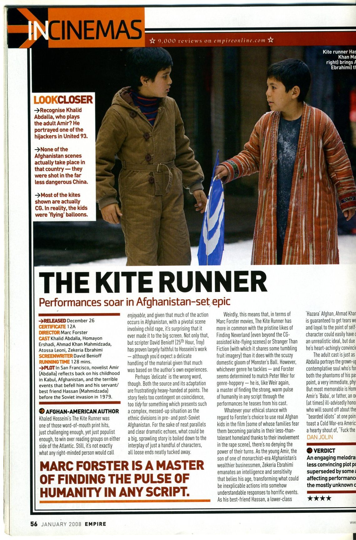
With our magazine, there we not many conventions that could be challenged. We researched magazine such as Total Film, Prevue and Empire and decided that we wanted a light review that focused on the film's theme's and more the different side of the production company we had created.
 |
| Empire Magazine Review |
 |
| Sight and Sound Magazine Review |
This was because after reading an article in another film magazine called Sight and Sound, we felt that it was best to avoid the way those articles were written as they approached film as an art and it was not the approach we wanted. We decided to the followed the conventions of using two columns and Sans Serif font for the heading and the Serif font for the main text as they are the two most commonly used fonts for magazine reviews.
 |
| Our film poster |
Also the Serif font that we used fit in well with the design of the magazine and does, in a sense, highlight our genre. With out breakout boxes, we had trouble with what were first going to have in them. But again we decided to follow a convention that is commonly used in Total Film as it was the magazine that we felt best suited what we wanted to show within our film.
No comments:
Post a Comment