Friday 30 September 2011

Practically Strangers-Script Redraft

EXT. Chiswick Graveyard. Day

Hallie sitting near a grave (of her boyfriend). She seems engaged in a conversation
Hallie
It's not easy, you know. But you learn to get by
it's like there's something missing in my life 
something that i can never replace....

*Flash*- Flashback begins (Post Production)

INT. Near (inside) a flat in Brentford. Day

Hallie walks out of the flat with a bunch of roses in her hand, she walks along the road, looking a little in deep thought 

Hallie
(Non- diegetic Voiceover- in her mind)
You learn to survive 
To carry on, even if something is missing 
A part that you rely on
A part that you crave
 I don't know how I've lived for the past year and a half
I'm still not used to living without you

EXT. Musical Museum Bus Stop. Day

Hallie 1 sees Claire sitting at the bus stop. She hears the girl talking to herself and finds her strange and feels uncomfortable
Hallie
(Voice over turns into Diegetic Dialogue)
How could you leave me?
Without even saying goodbye
I waited for you for hours(On-set dialogue begins)
You promised that you'd make it 
and yet you left me standing there like a bloody idiot 
for 3 hours, for 3 hours?!?!?! 
*turns to Claire*
Has that ever happened to you? 
Being left to stand in the pouring rain
waiting for your boyfriend near a cinema for 3 hours?


Claire
*looks away*
(Voiceover- in her mind)
Why is this girl talking to me? Someone just shut her up!

Claire and Hallie get onto the E3 bus

EXT. Outside/Near Chiswick grave. Day

Hallie and Claire get of the E3 bus. Both walk in opposite directions, without a word or looking at teach other

EXT. Chiswick Graveyard. Day

Hallie walks towards a grave and kneels down, she places the roses on the grave
*Flash* Flashback Over (Post Production)
Hallie
And that's what happened
*laughs*
You'd think it would've happened differently 
I wish it did too but there we have it 
a complete stranger that I'd never met
helped me to see it differently
See life differently 
And the funny thing is I never even spoke to her 
but come to think of it she did look familiar
*sighs*
 James, if only you could see me now 
you'd understand....
Gosh, I miss you more than you know 


EXT. Chiswick Graveyard- Day

Claire Enters. to the same grave as Hallie. She is shocked to see Hallie sitting there. Claire places a card near the same grave, however at this point Hallie does not see it as she is focused/deep in thoughts.Claire slowly walks away not being noticed. Few moments later she sees the card and suddenly turns around and sees Claire walking away. Claire opens the card to see that the name on the card is the same as the grave. She puts the card down next to the roses.

EXT. Chiswick Graveyard. Day

Claire is walking away. Hallie in the background far away
Claire
Its not easy you know, by you learn to get by.

The script had to be re-drafted as I realised that in the 1st Draft, there was not enough dialogue that would last over 5 minutes. Also I realised that we would use the dialogue to give the audience more information about James and his relationship with Hallie. Especially with the nature of his death. I think that there needed to be more of a conversation between Hallie and Claire. We had to find a way to explain the story and relationship between all the characters. 


Thursday 29 September 2011

Practically Strangers: Script- First Draft

EXT. Chiswick Graveyard. Day

Girl 1 sitting near a grave (of her boyfriend). She seems engaged in a conversation

Girl 1
Let me tell you about my day...

*Flash*- Flashback begins (Post Production)

INT. Near (inside) a flat in Brentford. Day

Girl 1 walks out of the flat with a bunch of roses in her hand, she walks along the road, looking a little in deep thought 

Girl 1
(Non- diegetic Voiceover- in her mind)
It's not easy you know, but you learn to get by. I really miss you at times, just can't help it I guess. sometimes it feels as though your still here with me, right by my side. I know you love roses so I've bought them special for you

EXT. Musical Museum Bus Stop. Day

Girl 1 sees Girl 2 sitting at the bus stop. She hears the girl talking to herself and finds her strange and feels uncomfortable
Girl 1
(Voice over turns into Diegetic Dialogue)
......

Girl 2
(Voiceover- in her mind)
Why is this girl talking to me? Someone just shut her up!

Girl 1 and Girl 2 get onto the E3 bus.

EXT. Outside/Near Chiswick grave. Day

Girl 1 and Girl 2 get of the E3 bus. Both walk in opposite directions, without a word or looking at teach other.

EXT. Chiswick Graveyard. Day

Girl 1 walks towards a grave and kneels down, she places the roses on the grave.

*Flash* Flashback Over (Post Production)
Girl 1
So that's what happened

EXT. Chiswick Graveyard- Day

Girl 2 Enters. to the same grave as Girl 1. She is shocked to see Girl 1 sitting there. Girl 2 places a card near the same grave, however at this point Girl 1 does not see it as she is focused/deep in thoughts. Girl 2 slowly walks away not being noticed. Few moments later she sees the card and suddenly turns around and sees Girl 2 walking away. Girl 1 opens the card to see that the name on the card is the same as the grave. She puts the card down next to the roses.

EXT. Chiswick Graveyard. Day

Girl 2 is walking away. Girl 1 in the background far away.

Girl 2
Its not easy you know, by you learn to get by.

Practically Strangers- Final Synopsis

After thinking about the practicality and deciding the best plot, we thought to develop the idea of 'Practically Strangers'.


Synopsis:
The film begins at the graveyard,a girl talking to a grave- who is her boyfriend. There is a Flash (through editing in post production) and we go into a flashback). The girl is recalling her day.
A girl is on a journey to a graveyard, she gets out of the house and walking on a road with roses in her hand (she does not leave them even for a moment). She talks to herself (non-diegetic, voice over in her head-but shes talking to her boyfriend). She says "It's not easy you know, but you learn to get by".


She gets to a bus stop (Location: Brentford- near Musical Museum), there is another girl (girl 2) sitting at the bus stop. The girl starts talking aloud (the non diegetic voice over becomes diegetic). Girl 2 finds it stange, she tries to ignore it and feels uncomfortable (this brings the concept of 'Britishness'- people being reserved). Girl 1 starts talking to girl 2, she thinks to herself "why is she talking to me?, just shut her up" (through voiceover). We see them getting onto the E3 bus.


Both get onto the bus- they both do not talk. (This is not shown on screen). They get off the bus and walk off in different/ opposite directions- (however both end up going to the graveyard- audience and characters unaware at this point).


The girl with roses (girl 1), is sits down near the grave and and places the roses there. Another flash (Flashback over)- "so that's what happened".


Girl 2 arrives and comes to the same grave a few seconds later- she is shocked to see girl 1 there. Girl 2 places the card in her hands near the roses and slowly walks away. The first girl doesn't notice- too focused. Moments later she suddenly notices the cardand turns around to see girl 2 walking away. She opens the card to see the same name as the grave (name on grave will be done through editing in post-production), In the card we also see its addressed to her 'boyfriend'- this shows that boyfriend was actually having an affair with both girls. Girl 1 she leaves the it next to the roses.


The second girl whilst leaving turns around and says "It's not easy you know, but you learn to get by".

Note: Girl 1 is now called Hallie, Girl 2 is Claire and the Boyfriend is James.

Commentary:


The things we changed was our cast- instead of woman (who had to look like she was married and the dead person was her husband) we changed it to a young gir and her boyfriend. We thought it would not be practical for us film on a bus so we only see the characters getting on and off a bus. Most of the dialogue is through voice- we would be better for sound quality instead of 'on set' dialogue. Keeping the brief of Britishness of we thought of the British people being reserved.


Our main target audience is 18-25, which we think is sutiable for this film with the concept and that the cast is young.


The main purposes for the film are entertainment- but with messages behind it- such as how you have to let go of people go one day. Also about British people being reserved- you never know who and how your related to someone- whether its being actually related to someone in terms of relationship or with feelings and the situation.


The theme and genre:

Wednesday 28 September 2011

Synopsis 3-Never Leave You

A woman, Claire, wakes up and realises that today is the anniversary of her husband's death, he was killed in some sort of accident. She enters her front room and checks all the pictures of them when they were together on her pc. She then decides to go and visit his grave/burial place. As she makes her way to the graveyard, she's followed and the man she is followed. Who then approaches her while she is talking and  to the grave and leaves an envelope by Claire. He says something that Claire does not react to and notices the envelope as the man leaves the graveyard. She opens the letter as she is leaving and runs off to find him but he has disappeared. As she walks out to find him, she is hit by a car. But the audience do not see it, they hear it. There's a shot of the card with a picture of her and her husband on their wedding day with the words on the card; "I'll never leave you. Hakuna Matata."

Practically, this film is quite complex in the fact that we'd have to cast an older audience. Also the car accident would also be quite hard to film because we don't have stunt doubles. Also I think that it would be too long to film and the message we would be trying to portray would take longer for the audience to fully understand.

Friday 23 September 2011

Synopsis 2- Practically Strangers

This was one out of three of our Final Ideas for our Short Film; we thought this idea was the most practical for us to create as the others we much more complicated. Therefore this idea would be further developed, to create a suitable and original short film.


Synopsis:

A woman is on a journey to a graveyard visiting her dead husband holding a bunch of roses, at a bus stop she meets another woman, the woman with roses talks the other about her dead husband and about life, and she ignores her. This continues daily after three days the other woman talks back. The rose lady is oblivious that the other lady is going to the graveyard as well. After the bus journey both get off at the same bus stop and walk in opposite directions. Both end up at the graveyard and see each other- shocked!


We were influenced by films like Dus Kahaniyaan (from the segment Gubbare (Balloons)) which is based in a graveyard and the main prop was balloons in this film and we chose to use roses, as there are significant props used in many short film such as Gone Goodbye also uses a balloon. We thought to make this a ‘happy-go-lucky’ short film with a message which was like Sign Language.


This would be practical as we can easily get roses and use these for our film. We could film in a graveyard although this may be a little difficult to chose a suitable and graveyard and 'be sensitive' towards it. We would have to film when there is no one/ hardly anyone iin the graveyard. 

Synopsis 1- Can't Escape Fate

The first idea we came up with is called Can't Escape Fate. It is a Thriller about a girl, Frankie, who lives in a council estate. She's not very succesful in life until today. Everywhere she goes, whenever something good is about to happen to her this dark figure appears. As she walks into her wokplace (an secondary school), the figure appears at the main gate. She finds out that the teacher who had the job she wanted has moved away and the school is giving Frankie her job. After a long hard working day, Frankie makes her way home and as she enters her block, the figure appears again. This time, she gets a phone call from her mum saying that she had to cancel her holiday and she'll be down to visit her in 3 days. Then as Frankie picks up post the figure appears one last time. It's a letter telling her that she won a competition she entered and has won a holiday.

Later that night, she decideds to go partying to celebrate her promotion and as she makes her way home, she is apprached by a man and is stabbed. Suddenly one of the girl's who was with Frankie in the party wakes up. She decideds to call Frankie but there is no answer. As she turns on the T.V there is a news report about the death of Frankie and the reporter recalls the exact events that happened in the girl's dream. The film ends with the reporter's words: 'You can't escape fate' overlapping the end credits.


The idea came from a film called The Other's whch is about a family who have moved into a house are experiencing what they believe to be ghosts. However, what they do not realise is that they are in fact, the ghosts in the house themsleves. Although, I think that stylistically it could have a dark tone to it. Dialogue would possibly have to be a voice-over in some parts and amybe some recorded on-set as well. The only problem however, would be filming a party/ finding ways to film at night as well.

Our Film- Developing Planning

 The next stage of planning after getting general ideas for our short film, we developed ideas from the ‘Films that influenced us’ and how each of the film gave us ideas.


Sign Language:
  • Lighthearted
  • Mockumentry
  • Message
  • Breaks the forth wall


Dus Kahaniyaan:
  • A Journey
  • Graveyard- 2 main people
  •                    -Balloon as a significant prop (Also in Gone Goodbye)
Veronique:
  • A contrast between fantasy and reality
  • A journey
Memories
  • A significant prop
  • A message


We thought we could use these ideas/elements to help us think of a original short film. We also kept in mind the practical side of it, for example in Dus Kahaniyaan, Gone Goodbye and Veronique there is a journey involved on a bus which we would not be able to do however we could still use the idea of a journey perhaps the person walking from one place to another or another means of transport such as car (we could use a parents car). 


In memories, there is a message behind the film. This is a good way for the film to be effective as audiences would most likely remember it. 

Our Film Ideas- Planning


After researching about short films we decided that the target audience for the film will be 
18-25 year olds .

Based on this we did a brainstorm for general Ideas for Short Films that would perhaps appeal to our target audience. (On A3)

Firstly we thought of ‘Films that influenced us’, these were the films:
Short Films:
Sign Language (Oscar Sharp)
Veronique (Patrik Beurgh)
Gone Goodbye
Memories


Bollywood/Indian Films:
Dus Kahaniyaan (10 Stories)- Sanjay Gupta 2007
Akela (Alone)- Drama 2006


Dramas and Hollywood/British Mainstream Films:
The Others 2001
Death note 2006


Other Relevant Films:
Year 7 Short Film Trailers (Brentford School for Girls) 2011
Broken Disappearance (Our Previous Film we created) 2011


As we were influenced by films of other cultures, we also thought about a long Bollywood film being condensed into five minutes. This could be a parody or a prestige of the film. However, this would be practically impossible for us this is because Bollywood films tend to be hours long (2-3hours) therefore it would be hard to convert this into a 5 minute film trying to get the point across.
We thought to do a mockumentary, we were thinking to do this as a news report making the genre a thriller (which was from the ideas of the year 7 thriller film trailers), on the other hand we could make a mockumentary/documentary by thinking of a theme and making it light hearted such as the film sign language. For this we thought about using different characters with different ages with teachers, sixth form students and younger students.
Furthermore, as we thought of a light hearted short film, we thought we could use uplifting scores, happy bright colours, inviting titles. We thought about how we could keep the Brief of ‘Britishness’ in mind therefore as the British people are seen as reserved, we thought about how a character could do ‘good things for others’ which is something we would not see a British person do and how the public do not tend to interact with others that are strangers as we like to ‘keep to ourselves’. 

Planning Initial Ideas

Today, we started to gather inital ides for our short film. Using the ideas I had written down before and the influences we got from other short films for example, Sign Lanuage, we brainstormed our ideas and wrote different sections on what we could gather together to give us a few ideas. We brokeit down into themes, films that influenced us and other ideas. The planning over all was quite hard as we had to then narrow down over genreal information into sepereate ideas. We already had one idea and then had to create another 3. Although we did have some idea of what kind of film, we wanted to create. Each idea that we came up with became more copmlex and practically we found that some we would not be able to film.


Sign Language gave us the intial idea of creating a more happy-go-lucky type of film. The film aims to highlight things you don't notice. This is sort of what one of our ideas was to do. Although the message was a little different. I found it quite hard to come up with ideas that didn't clash or become to complexed fior us practically and stylistically.

Another film that influenced us was Gone Goodbye. The subtle twist that is revealed at the end of the film, with the balloon being the voice-over and rather than the man who the audience assume is the voice-over is effective and it is something that we are hopefully going to aim for.


I think if we develop the ideas that we have created and develop them as best as we can, we could find out ways that we can add symbolic references or other ways of trying to make our film as subtle but effective as we can to clearly show the message. Also the dark colours of the cinematography, the Sepia colour, for example, is effective as it gives off a sullen atmosphere. This is something that I think we could use in our film as it may make it more effective and may help to make the theme more clearly.

Another short film that uses colour that is also used to make the film more effective is Memories. The colour may in some parts suggest the time of day. However, it's mainly used to go back-in-time.


An idea that we could use for Practically Strangers, is the going back-in-time to show the times of when the character was with her husband/partner before he died. I think that using colour can help to change the atmosphere and show a theme more clearly rather than just using Non-Digetic sound or Visual and Audible effects.

Magazine Research-Film Magazines

There are a range of different film magazines. Each of them with a different aim and purpose. They range from Empire, Sight And Sound and many more. The main ones are: Total Film, Empire, Prevue and Screen International.

Empire


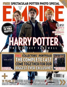
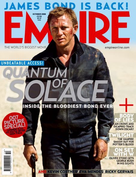
Empire magazine first published its issue in 1989. It is the most biggest film magazine in Britain and is also published in Russia, Australia and Turkey. The magazine focuses on mainstream and art house films but mainly focuses on mainstream. It has a range of features including a Top 10 feature as well as DVD reviews and even a Classic Scene, which contains a transcript from a well-known film. The magazine mainly aims to give a light-hearted view on films and they leave it up to the reader on whether they should read it or not.


Empire magazine articles tend to be more light-hearted and witty. It has a sense of witty banter that would typically be associated with men. This is because the magazine tends to review films that are typically hard-action type films. The reviews try to find at least some sort of joke to the film whatever the content. The key thing about Empire's articles is that whenever a film is reviewed whatever the article length, it is always left up to the audience to decided whether they should watch the film or not. They also focus more on either the cast or the director and explain in small detail the plot of the film. The witty approach to this can be shown in the William Thomas' article on Sherlock Holmes (2010 film directed by Guy Richie). William focuses more on the directorial skills of Richie and the portrayals of the famous characters by Jude Law and Robert Downey. Jnr. The language throughout the article is informal and relaxing. Therefore, the age range of Empire magazine is 18-25 and typically is aimed at men and people who enjoy the funnier side to watching a film.


Sight And Sound


Sight And Sound was first published in 1932 and was then owned by the BFI (British Film Institute). The magazine focuses more on the art-house films although it does review all film releases each month. The mode of address is aimed at people who tend to look at film as an art form and enjoy the history and thinking process behind the. film rather than the film itself. The age range would probably be 30+ because of the language and formal approach the journalists take when reviewing films.


An example of this would be Ginette Vicendeau's article on the French film The Witnesses. If the film was reviewed by a journalist who works for Prevue(film magazine for cinema company Vue) would explain more about the cast and director and give a little insight to the main plot. Ginette within the first 2 columns of text reveals the entire film. This because she then goes on to mention about other French films that inspired the making of the film. She talks as if the readers would already have a knowledge of French cinema. Therefore the class range of this film would be from the Middle Class upwards.

Prevue


Prevue is the film magazine made by the cinema company, Vue. The magazine's approach is very light-hearted and informal like Empires. However, the articles focus more on the cast in the reviewed film. The articles do not take up much space and are generally short. An example of this would be review on the recent film 'Did You Hear About The Morgans?' (starring Hugh Grant and Sarah Jessica Parker). The article focuses more on the relationship between Sarah Jessica Parker and Hugh Grant in the film. Although it is very brief, it  portrays a negativity towards the film and Hugh Grant. This could suggest that the magazine has a sarcastic view on the films they review. Again with Empire, the magazine leaves it up to the audience on whether to watch the film. Although with this article, it has a sarcastic sense to it. Si, I think that the age range would be the same as Empire, 18-25, however, Prevue would be aimed at people who just generally enjoy films and know about certain actors within the business. 

Magazine Review Research- Sherlock Holmes

Sherlock Holmes is a 2009 Action-Mystery starring Robert Downey Jr. and Jude Law. The film is based on the book character and is about Holmes apprehending a man called Lord Blackwood, who is obessessed with gaining power to take over the world using dark arts. This film review is from the Febuary 2010 Empire magazine.

The vreview takes a more light-hearted witty apprach to this film and in comparison to the Sight And Sound's review of The Witnesses is a lot less academic. The aim of it is to inform its readers about the upcoming film and give an slight overview of the cast portrayal of theri characters. In particular, Robert Downey Jr.'s portrayel of Sherlock Holmes. This is because it's his first film since he made Iron Man in 2008. Also with the directr, Guy Ritchie( Madonna's ex-husband) taking on his first feature-length directorial debut, the review mentions a little about his skills in the film. The article is more biased in the sense that it wants its readers to go and see this film and has a more jokey take in certain areas. This shows the target audience that it is aiming for. Which would seem to be men who are into action genre films and enjoy a good laugh at the cinema.

The layout of the article is quite sly in the snese that the main image takes up the majority of the space. This could siggest that the writer could not think of much more to write as well as the fact, that the article may only have taken up a little amount of space. The use of the breakout paragraph in the middle also shows this as well. The review uses simple conventions but each is very effective as the reader would possibly be more drawn to the image rather than the article. There is a minimal amount of colour in the layout and again suggest the aim of the article is rather to make the readeractuallly read the text and/or look at the snaphot from the film.

In terms of ideas, I find that using less is more. It looks more effective to use bigger images and less writng. Also amkore light-hearted approach to the review means that it's left to the reader to make thier own decision as to whether they want to go and watch the film or not.

Magazine Review Research- The Witnesses

The Witnesses is a 2007 French dilm directed by Andre Techine. It is about an afaair that happens with a married man and his partner who is dying with AIDs. The film focuses on the themes of troubled relationships and homsexuality. The review of the film is very detailed, in the fact that within the first 2 columsn the writer, Ginette Vincendeau, reveals the entire film's plot. Therefore, it gives awaythe article's main focus. As it won't be about telling the reader's to go and watch the film because it looks good or has an interesting story. But, it will be explaining how the themes are adressed and explains more about the view of the film from a more academic point-of-view.

The review of the film in this magazine can be borken up into 6 sections. The first being that Ginette gives a complete synopss of the film, next she then starts to explain abiut the narrative structure of the film and breaks it down to the original foundations. She mentions other books and film referances throught the article. As if she is expecting the reader to already have some background knowlegde into French Cinema. This shows the her mode of address/target audience for her article are people who view cinema more as an art form rather than just entertainment. This is also shown through the structure of the article and the amount of referances she makes.

The layout of the article again shows the type of audience that this could appeal to. The average teen would not read a film review this long which therefore can give an insight as to where this would be printed. It does follow the normal convetions of a magazine review with the use of th breakout paragraphs and boxes. In the top right-hand corner, is a small interview with the film's director about what he feels his film aims to show. Overall, the article is a little too heavy but is balanced by the critism in the middle two columns of the text.

For the short film, we aim to make, i think writing an article in this kind of detail would chnage the auidence we aim to attract. Especailly as the themes we are aiming to include are more light-hearted and becausae of the film's length, it would be wrong to explain every ascpect of the film in a review. I think also it would take away that element of fun and enjoyment of watching the film because after reading the article, you'd end up knowing too much. So, your experience would be different to other people who watch it becuase of that fact.

Magazine Review- The Road


Magazine: Total Film
Film: The Road
Director:


This film review is from Total Film (www.totalfilm.com).

There is a lot of different 'objects' on this review. However, the main picture takes up half of the page and this makes the column size smaller, this helps the reviewer Jamie Graham not write much about film, which can be both a good and bad thing for the audience because, good- doesn't give away too much of the story plot, however for some people this may not be enough information either.

The main review article gives a balanced view so that the audience can make a choice for themselves whether to watch the film or not. The srticle straight away begins with the review of the film and some general comments about it throughout. They do not go off topic.

For the house style, they have a breakout box with 'See If you liked', which is  given in most reviews as there are references to other films alike (and some books) so this futhermore helps the audience to make a wise choice. They also have information about the film in terms of certificate and director the same as Prevue. They have a few pictures and graphics,

In this review there is also graphics, this help to make the article look a little more interesting so there is not too much writing for the audience. The style of writing however is for a little older audiences, not too young but also not too old such as 'Nuclear War, Environmental catastrophe? Punishment from the above'.

This could be suitable for our film depending on the final desicion of the audience for the review. However my personal opinion is that the layout is not clear and it seems 'all over the place', however it is good that there is a balanced opinion and they have a little breakout box with 'In Short' which easily summarizes the main point of the review which is good for people who do not like/ have time to read the whole article.

Magazine Review Research- Prevue Magazine

Magazine: Prevue
Film Review: Did you hear about the Morgans? (2009)
Director: Marc Lawrence


This film review is from the magazine Prevue.

We see that the headline for this magazine is 'Did you Hear About the Morgans?', this headline that they chose is the same as the name of the film leaving it simple and 'straight to the point'.

The general layout for the review is quite simple, it has a few pictures and a few breakout boxes and a breakout paragraph. The main picture is quite big therefore condensing the amount of the actual written 'review' for the film. Pictures are normally big on the pages so that the people/critics writing the review don't have to write too much about it, therefore this helps to keep it short and keep the readers reading unless it is an academic review such as Empire who normally give reviews that have heavily detailed information (but still balanced) and with other references and strong language.

The two other pictures are smaller in size and placed at the side of the page which breaks it apart so it looks neater and not over-crowed split into two parts. All picutres have the main stars showing its really focused on the pair.

This review is different compared to Empire because it does not give the full story and is not as much detailed. There is a short synopsis that doesn't reveal to much of the film and then the article diverts to the main stars who are Hugh Grant and Sarah Jessica Parker. The review as most magazines does not critisize the film, therefore it is not balanced as other would be, this would make the audience go and watch the film this is because of the intended audience.
The intended audience would be people who go to the cinema often checking for good films releasing. This is because the language is simple, there is limited information (so it doesn't spoil the film) on the review and it is mainly biased, therefore young people would tend to read this review. Personally if I read this review I would think this is a good film to watch as there are no bads points and it is written simply not going to deep into the story.

For the house-style, there is a big title in big, bold capital letters. Apart from a few titles, the breakout paragrapg and one small breakout box the font remains the same throughout. The colour of the font is different for the main title (to make sure it stands out) and the film information (which is what the audience would need to know whether they read the review or not), the rest of the article has black font.

We will be creating a short film, therefore I think this is a suitable way to write the review because short films have a short plot therefore this type of review wouldn't give the story away and futhermore people will be attracted to watch our film if there is no criticism. However we would not be able to write a lot about the main stars of the film because they will be untrained, unknown actors therefore there will be not much point in commenting on them, only a little could be added about their performance throughout the film.

Thursday 22 September 2011

Ideas For Short Film

After watching some of the short films in class, we have been coming up with ideas that we feel could make a solid short film. The film that started of my ideas was Sign Language, we aim to make a witty, light-hearted film that possibly focuses or surronds the subject of seath. My bais idea is that we make an uplifitng film that doesn't have to be dark or upsetting. My small synopsis so far, is that is about a girl who is going on a journey to a graveyard to visit her dead partner. However, the point-of-view will be a subjective one. As I think that it would be too hard to give it away. I'm not sure on whether we should add a one-plot twist yet. In terms of dialogue, we would possibly have a little on-set dialogue and voice-over.

One of the themes that we could address is getting by in life. I'm not usre how exactly we can approach this but I think it would be effective to take on a taboo subject in a more uplifiting way because not many short films do. If possible, we could use 360 degree, low and high angle shots as I would want to try and show the different stages of the character's day i.e, her moods or how she views herself in society. The character I would be trying to portray would be a happy-go-lucky, joyful but at times she can go off into her own world and not focus on certain ascpects. I think the aim would be not only to show her journey to the graveyard but the detioration of her mind and how she's not coping with the death of her husband.

Film Poster Research- The Last Samurai

The Last Samurai Poster


The Last Samurai is a 2003 American Epic Drama starring Tom Cruise and Ken Watanabe. It is set during towards the end of the 19th century, specifically in 1876. It is about an American war captain who is kidnapped during an attack of the Samurai and learns the skills and their ways of life.

The main attraction of the film poster is the iconic image of Tom Cruise. It draws your focus to him and it will help to attract a wider audience. This is because the film may be aimed at men and young teens becuase of the fact, it's about a war. However, Tom Cruise is seen as a sex symbol in the film industry and is vetry well-known throughout a range of ages. So therefore, the film can attract women as well. Although, it can be suggested that he may not have been acting for a while previously before he made this film so he can be using this poster as a way to re-start his careeer.The spacing between the letters of his name is to take up space on the poster as it would look a little strange if the font was all bunched together. The background image behind Tom is plain because of the fact he's face takes up the majority of the poster. If the background was an actual image rather than just plain colours, it would not work with the rest of the poster and it would look cluttered.

The use of the foreground image of the men riding to war, can also be seen as iconic as it tells the audience an insight as to what the film is about. Again, it is used to take up space but also gives an idea as to the time the film is set. Which is also shown through the title. The use of the font is plain and simple as the main focus of the poster is Tom Cruise and the fact that he is in a new film. The billing block on this poster is quite big and therefore shows how to take up space. The use of the Black background behind is effective because it draws your eye to it. Which isn't usually a fcous with films posters.

It gives me the idea that doing that makes it useful because then you cna equalise the use of the colours and fonts that you use on the film poster. Another idea I might take is the use of the plain background, it menas that you can use more layers to make the poster more eye-ctaching and it's more simple and makes it more effective.

Tuesday 20 September 2011

Research: Conventions of Film Magazines

There are many conventions of a magazine layout in terms of Technical codes and these are:
-Section title
-Headline
-Byline
-Pictures, Graphics and Logos
-Introductions, subheading and breakout paragraphs

Film Review:
Toy Story 3
TotalFilm.com
 Issue 170 (July 2010)


Film Review Research- Main Magazines (UK)

The main film magazines in the UK are Empire, Sight and Sound, Total Film and Prevue


Empire
Empire is a British Film Magazine that is published monthly.
Johnny Depp - Sight and Sound Magazine [United Kingdom] (August 2009)


Sight and Sound


Sight and Sound is a monthly film magazine which is published by the British Film Institute.


Article: A Time to Love and A Time to Die

Different Film Magazines have different layouts, style for the film reviews. The article for film of the month which has the headline "A Time to Love and A Time to Die", is a very detailed, formal and academic review of the film The Witnesses (Les Temoins) which is a French cultured film. In this review they give the full synopsis which tells us that so if you were to read it before watching you would know and understand more of the context.

 The audience for this film would be people who view film as an form and 'high culture'. The expect the audience to have a good knowledge about French Cinema, the culture there and the language. For example they mention various French films such as J'embrasse Pas (1991), Les Roseaux Sauvages (1994). Some phrases used in the review are "Somewhat against Versimilitude" and "But the wan Julie cannot even evisage mixing a career and a relationship".

The structure is: the film is introduced with references to other films, a full synopsis is given along with a discussion for the narrative structure and style. There are references to other books that are relevant. There is a balance which most reviews have of both the positive and the negative parts. Then the ending is summarized and given a closure, therefore it does not abruptly stop.


Magazine Film Review Research- Purpose

The purpose of a magazine film review is to give the audience more knowledge about a film before the go to see it or prior to its release; it gives the audience an overall balanced picture whether they would like the genre or style of the film, comments on the performance of actors are given, the synopsis (which sometimes vary on different magazines of how in depth they go).  


A film review is different to a poster, the obvious reason being that a poster is visual whereas a review is mainly a written response. Posters normally tend to give a positive impression which the audience is aware of which is created by the production crew, whereas a review is not biased as it can contain both positive and negative opinions and the film is reviewed by different professional film critics and some the members of the public also express their views.

The way audiences interact and understand each one is they are able to decide for themselves whether it is worth watching at the cinema or not.

Film reviews are important part of a film's marketing campaign because it is free publicity for the film, however they contain an element of risk because if there was a negative review for the film then it could fail at the box office immediately on the other hand if there was a positive review from the critics then this would increase the gross of the box office because more people would be likely to watch it especially if they are well known.


Different film magazines have different target audiences, for example, Sight and Sound is aimed people who view films as an art therefore it would be for older people. Therefore their reviews are in depth and there are many references to other forms of media and normally the person reading the review would have to have background knowledge of other films.


However, film magazines such as prevue would have a complete different target audience of people who watch films for pure entertainment as they don't write a complete analysis of the film.  

Poster Analysis- Sherlock Holmes

Poster: Sherlock Holmes (2009)
Director: Guy Ritchie


These are posters of Sherlock Holmes, the first one is the main poster that represents the film, the second poster is a character poster of Irene Adler played by Rachel McAdams.
The posters have some features that are the same such as a tagline and release date however some are different such as the official website. Even though features are similar they are shown in different ways relating to the film.

These posters show that more than one poster can be produced for a film, this is because each poster generally attracts a particular/ different sections of audiences . The poster with Sherlock Holmes is blue, its quite 'strong' or 'macho' which shows us that the film would be targetted at a male audience. However the poster with Adler shows us a soft side, it has feminine colours (the pink/purple) therefore this poster is most likely to attract a female audience.

Another example for posters attracting different audiences is for the Film 'Romeo and Juliet'.
For the first poster we see Romeo and Juliet (Leonardo DiCaprio and Claire Danes) kissing which shows Romance and one of the themes however we see everyone else surrounding them with guns from either side which show clashing and violence. Therefore this poster would attract a male audience. However, the second poster says words like 'hope', 'despair', 'vengence' and 'love'. This poster shows the theme clashing and violence but also shows love, this is done in a different way (the layout) which would attract a female audience. This is a way how film makers a lot of audiences by presenting things which look attractive to different people in different ways, this would of course help the films to be a box office success (which this film was almost grossing $148,000,000).

Poster Analysis- Harry Potter and the Half Blood Prince

Poster: Harry Potter and the Half Blood Prince (2009)
Director: David Yates (Novel: J.K. Rowling)

Harry Potter and the Half Blood Prince is the 6th film of the series. It is about a boy called Harry Potter who is from the wizarding world, who has to defeat his enemy Lord Voldemort.  

The poster features the main characters/stars Harry Potter (Daniel Radcliffe), Hermione Granger (Emma Watson), and Ron Weasley (Rupert Grint) and Albus Dumbledore (Michael Gambon) who are present in all the film of the series. Daniel is at the closest to the camera which shows he is the main star as "Harry Potter" whilst Emma and Rupert at further away showing although they are main characters as well but support Harry. The characters are all holding wands which also bring the theme with the props of the wizarding world. The expressions of the characters also show the tension in the film with the theme of a battle between good and evil.

The title is unique in this poster because it has been half cut off (Harry Potter), however because the previous films are famous and it is a well known series the audiences would know the title. It is like HP is a known brand and so the rest of the title "and the Half Blood Prince" appears in the poster. The titles have been created with graphics which suit the theme of the magical world therefore it is effective.
The tagline is "Dark Secrets Revealed". This tagline is effective because it suits the film and the poster as the colours are dark and blue effects make it feel 'cold' and 'dark' as the battle with Voldemort is about to commence. The choice of colours bring the effects of this which makes it look interesting for the audience who would expect it to be thrilling especially as its is an adaptation of the novel by JK Rowling and many audiences would know what to expect to happen.

The poster mentions the release date 'July 15' like most posters to make the audience aware when the film is to release which is important information.  The film also has the official website, which is where audiences can find out more information as well.

There is a billing block which again makes the poster look like a film poster.

Poster Analysis- Bride and Prejudice

Poster: Bride and Prejudice (2004)
Director: Gurinder Chadha 
Bride and Prejudice is a Romantic Musical, directed by Gurinder Chadha based on the novel Pride and Prejudice made in a Bollywood style. The film is mainly in English with a little Hindi and Punjabi.
The title “Bride & Prejudice”- the ‘&’ is made to look like a musical note which tells the audience that the film will be a musical. The colours, bold lettering and capitalization made it stand out from far which is the main aim of posters to capture the eyes of their audiences.
It says "From the Directors of Bend it Like Beckham", even though it does not have the directors name, it shows that the audience is supposed to know the director through her previous film.
The main stars are Aishwarya Rai and Martin Henderson. The stars represent the two sides of Hollywood and Bollywood which is a part of the theme of both side interacting/mixing. As both main stars are the main attractions of the poster they give it a Romantic feel even though the colour red is not used which also tells the audience that the film is not deep or passionate but more ‘fun’. This is also shown through their facial expressions and their position of being back to back- it connotes a clash like a typical romantic film of the main characters who don't like each other at first but end up falling in love.
The background is divided into two parts interlinked, one side of India which can be seen by Indian people in traditional costumes and the Taj Mahal, even though the location is not anywhere near the Taj Mahal, this is an iconic image which represents India because it is a famous landmark known throughout the world as a romantic place therefore also showing the theme of romance. The other side is of Hollywood which is represented with the Hollywood sign and the American people. The people on either sides look like they are dancing which also makes the movie look fun to watch and it looks like a film for everyone to enjoy, this is further denoted by the colourful confetti.  
The tag line says “Bollywood meets Hollywood … and it’s a perfect match”. This tagline shows the theme of romance as we associate love/ couples to be 'perfect matches'. Bollywood films are normally 'musicals', which again shows the theme. There is a contrast as it is like 'opposites attract' and there is also a little repitition and rhyming words because of the 'H/B- ollywood'. It is a catchy line which audience would be likely to remember
The billing block as the bottom of the poster shows the release information as “coming soon” in big lettering. This makes the poster look complete as a typical film poster, the blocks make film posters look different from normal advertising posters

Monday 19 September 2011

Poster Analysis- Avatar

Poster: Avatar (2009)

Director: James Cameron


Avatar (2009) is an epic, sci-fi (science fiction), main-stream film written and directed by James Cameron. The main star cast in the film are Sam Worthington (who was also in Terminator), Zoe Saldana (Pirates of the Caribbean and Star Trek), Stephen Lang. The film was released in 2-D, 3-D and 4-D. Initially James Cameron planned the film in 1994 however he did not continue because of the lack of technology and equipment that he thought would be required for this film at those times.


The theme is very obvious in this poster as a Sci-Fi genre film, this is because of the images used of the Avatar (which looks like an alien) with a moon. This is through the main characters and the blue colours make it look like outer space which is the location where it is mainly based in.In the background, another world is shown (which in the film is known as Pandora). Again this shows that the film is not based on earth but outside it because we see creatures and land which we do not see in this world.


The colours contrast on either sides (top and bottom) of the poster, giving a mixtures of feelings or warm and cold.


The film poster has text which says "Experience it in IMax3D", this tell the audience that the film will be released in 3D, this is written at the bottom of the billing block. As technology is progressing films are being released in 3D which make the audience experience it as if they are really there, this is important for a film like this because the effects, colours and graphics (CGI) would grab the attention of the audience making it a good film to watch.


The title is "Avatar", the font of this title is which is also specialised t look different and give it a feel of Sci-fi. Both the title and lettering is simple to contrast the background which has a lot going on.


Another part of the text says "From the Directors of Terminator 2 and Titanic", these film titles are mentioned because these were successful box office films which audiences enjoyed. As posters are created to give the film a positive impression, the two films mentioned before would make the audience automatically think that this will be also a good film. The text also mentions "James Cameron" which is highly significant as he has made good films in the past so there is more recognition for his work, and keep promoting him with good films.


There is no tag line present in this poster, it relies heavily upon the images therefore it makes the audience think for themselves and it doesn't reveal too much information as this was a teaser poster. However, the taglines for this film are "Enter the World" and "Return to Pandora". It can be argued that the tagline is through visuals as it shows the world of pandora, a different world that is outside of earth in space. Normally taglines are catchy to sum up the plot or theme which the audiences tend to remember and they reinforce what the film is about. This tagline is simple which helps the audience to remember it and it also is what the film is completely about (the world of Pandora).


There are also no names mentioned of the main stars in the film, this shows us that the audience should be familiar with these people (there pictures) as they would have appeared in main stream films which audiences would recognise. Therefore overall, this poster makes the audience think with visuals instead of text.

Film Poster Conventions

The main conventions of film posters in terms of Technical codes are:


-The title: These are specially edited/ created with special effects to make the font suit the theme of the film.
-Name of the star: The main celebrities present in the film are normally mentioned on the  poster.
-Picture/Image of the star: The main stars have their image as the main attraction on posters, they are shown through their characters
-Billing Block: This the the information bundled together normally placed at the bottom of the poster, people generally don't read this information however it is what helps to make the poster look like a film poster instead of a general advert
-Tagline: This is an important element because it give the audience more information about the film. The taglines normally follow a pattern to make it catchy and something the audience is most likely to remember. They can have the 'rule of three', rhyme, a contrast, balance, or repitition.
-Background: This has different effects on the audience as some posters are incredibly simple with not much background but with the main stars, however if there is a background it shows other features of the film again giving the audience more knowledge about what the film is about.
-Age Certificate: This helps to let the audience know the minimum age it is suitable for therefore about if the content would be suitable for minors.
There are different options available in terms of which ones appear and how they appear because there is certain information that the creators would like the audience to know. For example, the movie poster for the film Avatar had ‘From the makers of Terminator’ therefore as this was a successful box office film it would make the audience the creators are back with another great film so manipulating the audience into thinking to go and see this film as well. You would not see a film that would mention a box office flop film as they are trying to give the film a positive impression on the audience.
Due to technology, even fonts can be utilized to make them suitable for the theme of the film. If there was a new actor who was going to debut in a particular they may not be on the poster as no-one would know who they are therefore there would be no point in placing them on there representing the film. This is the same with Short films which is why on posters there are normally iconic images placed.

Teaser Posters are more simple as these come out before the main final versions.
The techincal codes they have are:

-Actor's Name
-Character's Name
-Character's Image
- A tagline/decription associated with the characters
-Simple background which is same for each character