Friday 9 December 2011
Questionnaire
This is the questionaire that was given to audiences to answer for Audience Feedback for the magazine review which was created by me.
It has been created by Google Docs.
This has been embeded therefore, if any responses that are made they will still continue to be submitted. So audiences are able to directly fill it in from here or via a link that can be sent to Facebook, Twitter, Email (anywhere).
Thursday 8 December 2011
Final Film- Practically Strangers 2011
This is the final version of the film.
This was distributed via YouTube, Facebook and Twitter so that we could collect feedback for audiences.
Embedded onto the Blog:
This was distributed via YouTube, Facebook and Twitter so that we could collect feedback for audiences.
Embedded onto the Blog:
Wednesday 7 December 2011

Tuesday 6 December 2011

Monday 5 December 2011
New Magazine/Poster Images
As mentioned before, Rhian has dropped out of the fil therefore we needed new images for the magazine and poster.
Here are some images taken at the graveyard for the magazine and poster:


Here are some images taken at the graveyard for the magazine and poster:

A grave- the main location the film is set in with the roses and card which are the main props used by both characters.

The main character Hallie next to the grave with the roses.


The other character- Claire with the roses on the grave and the card in her hand- the key props
The changes for the agazine will be that instead of one picture of both characters next to the grave, there will be two pictures of both character with their key props in costume. Also, Rhian name will no be replaced with Carolines for the cast.
The changes to the poster will be instead of Rhian leaning against the card, now Caroline will be placed there.
Sunday 4 December 2011
Rhian Drops Out- Caroline Steps in
Unfortunately, Rhian Vidler who was the main character (Hallie) of Practically Strangers has dropped out due to scheduling problems with us therefore she cannot film on the days that were available.
Caroline Braganza has now replaced Rhian and will play the part of Hallie. However, I, Payal Jaiprakash will be continuing to play the role of Claire.
New Cast
 Caroline Braganza as Hallie/ Girl 1
Caroline was chosen to play the role of Hallie because she looks like an ordinary girl, age between 17-18. Her hair will be out so that she looks young and to suit the character of Hallie and will play a convincing role and helps the audience to see the age of the characters actually are which already give a bit of background knowledge to the audience of their personality this would be through stereotypcial ways such as carrying a handbag/shoulder bag, wearing make up, hair out. In addition, she will be carrying roses throughout the film (as women are normally associated with flowers).
Caroline was also chosen to play this role because she also lives close to the shooting location and is available to film on the days that we can film.
Caroline Braganza has now replaced Rhian and will play the part of Hallie. However, I, Payal Jaiprakash will be continuing to play the role of Claire.
New Cast

Caroline was chosen to play the role of Hallie because she looks like an ordinary girl, age between 17-18. Her hair will be out so that she looks young and to suit the character of Hallie and will play a convincing role and helps the audience to see the age of the characters actually are which already give a bit of background knowledge to the audience of their personality this would be through stereotypcial ways such as carrying a handbag/shoulder bag, wearing make up, hair out. In addition, she will be carrying roses throughout the film (as women are normally associated with flowers).
Caroline was also chosen to play this role because she also lives close to the shooting location and is available to film on the days that we can film.
Saturday 26 November 2011
Finding Non-Diagetic Sound
For the last week I have been searching through a freeplay music site in order to find background music for our film. It was quite hard as we were trying to find something that helps to put across the meaning and feeling of our film but also has an uplifiting and light-hearted feel. It took a very long while but after Wednesday and this morning I have narrowed it down to six. Some of which we are going to use in different scenes of our film. The six that I found are:
- Autumn Nights
- Elegy For One
- Brighter Day
- Should Have Known
- Hours Of Darkness
- Down And Out
Monday 21 November 2011
Test Shoot 2
Due to technical difficulties, this version became the second test shoot. We tried filming again, this time with roses, changing the look of our main character. However whilst uploading the footage onto the computers we realised there was a fault. When viewing the footage on the computer, the speed was increased and could not be reduced and we also noticed several mistakes (such as the tripod in the scene). Therefore we decided to do the filming again a third time.
Friday 18 November 2011
Test Shoot 1
This is the first version for the test shoot, as mentioned before we encountered many problems during the production stage. This video is from the first time we started to film. As at this point we did not have any roses so we used a teddy bear for the film instead. As the location was close to home it was easier to shoot in Brentford. However as Chiswick is further away we had less time to shoot there as it would begin to get dark earlier and so there were timing issues with the cast
We film various shots to see which would be the best to use during post production.
At this point we also did not have any bus stop shots as they were harder to film because of public access and there were people walking past and we decided that we would change the location of the bus stop shots and have them in Chiswick instead of at Brentford so that we can easily show the E3 bus which both characters will get on. There is no voice-over or any scores added yet, as we will add these for the final version.The quality for this video has been compressed as it is not our final version. Some shots such as the card have not been added because we did not have the photo of Adam so we could not add it onto the card. So there is no close up of the card that reveals the picture.
During post production we decided to change the following things:
-The main character Hallie would have her hair out to make look her like an 18 year old
-The roses will still be used even though we couldn't use them at this point
-We would add bus stop shots
-There will be more close ups and other angles for the final film compared to the storyboard
-We would keep the grave (so it doesn't look to old) and the other locations we were using as we thought it was appropriate for the film
-The card will have a picture of the three characters with one crossed out to added another twist that both characters actually know each other and still chose to ignore each other at the Bus stop
Wednesday 16 November 2011
Evaluation Of Production stage
Throughout the last few weeks. We have were filming our short film. However, we en-counted a few problems. The main problem is that we now have to use the majority of the footage we had filmed as our test shoots. Therefore we now have two test shoots instead of one. The main problem that we en-counted was scheduling. Our main cast member, Rhian, who we had cast as Hallie, was not available during our original shooting schedule that we had set. This was because she had gone away for the half term. This set us back and meant that we would then have to film on weekends and after school. However, we then found the problem was that due to the season change we couldn't film all of shots for our film. This was because it became darker around cpm.
Another problem was the fact that during our film test shoot. Rhian's hair was Blonde and her costume was different. This also caused a problem the second time around because it meant that we couldn't use the shots that she was in due to the change in hair color and hairstyle. After re-filming after our first test shoot, Payal was cast as Hallie. This was because we could not find anyone we felt best suited the part of Claire for the film. The second time around, I was cast as Hallie but we found that the shot types we used in the first test shoot did not work as well as we thought that they would. So we then decided to keep the original casting as we had had in the first test shoot. What we had then found during the second test shoot was when the footage was uploaded, some of the shots were running faster than others. The problem couldn't be solved so we then had to re-shoot for the final time.
We are now currently at the last stage of filming. We have approximately 3 more scenes to do. Hopefully within the next week, we should have all the shots for our film.
Tuesday 18 October 2011
Magazine Review Planning- Layouts
For the review, we thought to use big images and graphics with less writing. The reasons for this are that our target audience is young therefore if there was too much writing then they would probably not want to read it plus so that not the entire plot is given away
Futhermore here are some ideas what we could use for the breakout box:
Here are some of the layouts we thought of for the Magazine Review section:

This layout for be suitable for our target audience because there are different conventions on the review and there is less writing so people would be more likely to read especially because our target audiences start from a younger age who would not read much and read magazine reviews for entertainment purposes and to see if there the film being reviewed is good.
As our invented magazine is for pure entertainment this review would be suitable as it also gives a range of general information that audiences may need.
Futhermore here are some ideas what we could use for the breakout box:
- 'See if you like'
- Quotes: From Audiences, Critics
- Information about film (Film details: Certificate, Actors, Directors, Running Time)
- Film Gross/ Budget/ Box Office
- Star Rating
- Quick Summary of the article/ Statement about the film
- Other links to the film (such as the Official Website, Twitter page
- 'Send us your opinons' (For the film via email- Call to Action)
- Full Cast and Crew
Here are some of the layouts we thought of for the Magazine Review section:

This layout for be suitable for our target audience because there are different conventions on the review and there is less writing so people would be more likely to read especially because our target audiences start from a younger age who would not read much and read magazine reviews for entertainment purposes and to see if there the film being reviewed is good.
As our invented magazine is for pure entertainment this review would be suitable as it also gives a range of general information that audiences may need.
Film Magazine Planning- Images
The magazines images would mainly be of the film. They would try to have inconic images and pictures of the poster as well. The coulours would be light-hearted, warm and possibly quite funky. It would mainly be quite large or something that would stick in the readers mind to help increase the Word Of Mouth. The images would possibly be quite large and could depending on the genre of the film try to find something funny.
Image 1


Image 1

This picture is of our main character Hallie. We found a headstone that had the first nane of our character James. Although the surname is different, we should hopefully have the software to change the surname and date of birth and death date that is currently on that headstone.
Image 2

With this image, we tried to make sure there was something iconic. As well as being able to simply give the audience and insight into the film. Especially the genre and main theme of our film. This image could also be used for our film poster as well, although I think that using something more clever would be more effective for that.
Image 3

This image has a simplicity although it doesn't show any forms of romance or triangles to the audience. It immediatley suggest death however, there needs to be some connection to romance. Although these pictures were taken during our test shoot. The teddy will be replaced with a vase of roses.
Image 4

This image could used as it shows that connection between the 2 characters. However, there needs to be some sort of barrier between them. Possibly the card and the teddy could have been put on the opposite side and the characters would have to cross over. It could represent the relationship between them. However, I still think at the moment it needs to be a little more light-hearted. But once the teddy is replaced with roses it might be more eaiser to show the themes to the auidence.
Magazine Review Planning- Sample Paragraphs
We thought that the mode of address should be light- hearted, and formal (but not too much strong and technical language for the readers). We also thought the review would have a balance of both and good points so that the audience can make up their own minds whether to watch the film or not. However we thought to mainly talk about the storyline though not giving away too much and we would have little commentary on the actors performances as a review normally has.
Here are some Sample paragraphs that were written for the target audience for the Magazine:
Practically Strangers- 2011
A film to remember. There are key messages behind this film that makes the audiences think about it even after it ends. It shows that love can still be 'alive' even if someone has gone forever. *Actors Name* delievers a great performance and brings out the emotions of one of the main characters- Hallie, the roses she carries throughout symbolizes her love for her boyfriend James but an unexpected twist occurs.
Broken Disappearence- 2011
4 School girls, 2 dead, 1 leaves but what happens to the remaining one? A story about 2 ghosts who have a connection. Rhian senses the ghosts but can't seem to understand what's going on. What seems like a normal day at school turns out to be an interesting one. This is one film not to be missed. Payal and Latasha's (the ghosts) are good and help to win over the audiences especially with the convincing disappearing acts.
Magazine Review Planning- Advertising Profile
This is the Advertising Profile for our Magazine of the type of person who is targetted to read the magazine.
As the Target Audience is 15-20, the advertising profile was based on this range.
What type of Breakfast a person would eat?
Something easy to make and quick to eat because of the lack of time like going to school/college/university in the morning.
What mode of Transport would a person ride?
They would most likely travel on Public Transport as they wold be too young to own their own car.
What accommodation would they live in?
They would probably still be living at home with parents
What do they Drink?
Soft drinks, Energy Drinks
What do they like to Eat?
Most young people like to eat fast food
What are their Main Interests?
Mainly watching TV/Films, hanging out with friends, sports
Where do they go on Holiday?
Somewhere close to home, mostly Europe
Film Magazine Planning- Target Audience
Our film magazine would be called Film Feast. The magazine would be aimed at 15-20 This would be because it would be eaiser to aim our magazine at the same audience as our film and poster. This is because the lanaguage that we would use would an informal approach but it would aim to attract the average student and possibly someone who enjoys films quite a lot.
The magazine would be review both mainstream and artbased films. The mainstream section would be called Feast On This, there will be an upcoming film section called Indulge and finally the Short Film/art-house films section would be called Mini Feast. The magazine would also review films that the author would feel they would not do as good and that section would be called Junk It. The articles would take a humours approach to each review and try to leave it up to readers to decide whether they sould watch it. Also it would focus more on the film rather than the actors unless, it's a mainstream film. Finally there will also be a section on any info/rumours about actors, directors, producers or film companies which will be called Check It Out.
The magazine would be review both mainstream and artbased films. The mainstream section would be called Feast On This, there will be an upcoming film section called Indulge and finally the Short Film/art-house films section would be called Mini Feast. The magazine would also review films that the author would feel they would not do as good and that section would be called Junk It. The articles would take a humours approach to each review and try to leave it up to readers to decide whether they sould watch it. Also it would focus more on the film rather than the actors unless, it's a mainstream film. Finally there will also be a section on any info/rumours about actors, directors, producers or film companies which will be called Check It Out.
Poster Planning- Layout
In the final stage of the poster planning, some poster layouts were planned.
Here are some of the designs:
Design 1:
 The good thing about this poster is that the main props are used and indirectly shown to the audience giving them further information about the film. It has the main conventions/codes of main-stream posters. These are: Title, Billing Block, Main Stars (all 3), Tagline, Release information (coming soon) and information about the previous film of the directors.
-The card with the three characters is to show a love triangle (can be slightly seen with the shape of the card which is a prop used in the film.
-The rose which is another main prop is around 'James's' picture making it look effective. The idea behind this is that he is between two roses, therefore 'stuck' between both girls. Furthermore roses have thorns on the stem which indicates a bad situation- refering to the film twist at the end
-The titles would be quite feminine- therefore italics and 'curly'
The genre is shown through the points mentioned above and the deep colours (such as for the red roses) would shown romance.
-This would be heavily photoshopped because we would have to insert all three pictures onto the card through editing - especially with the roses and all other conventions such as title and billing block as well.
Design 2:

This poster idea is directly from a scene in the film for the background. This also has the conventions: Billing Block, Title, Tagline, information about previous film and release information.
-A good point about this poster is that the tagline in placed where the advert would normally be on a bus which is something you don't normally see
-The line between the door shows two sides and the fact they are back to back also shows the 'strangers' part. Futhermore this is emphasised with the bus as its a normal public place where most people are strangers to you.
-Again the title would be Italics with the main props on either side also showing 'distance between the two (being apart) but still joint with the title showing the connection between the two.
However, the bad points about this one is that
Design 3:

This poster is very simple compared to the others therefore does not reveal too much about the film. It shows the title inside the grave with both main props as well. However, this may mislead people into thinking the genre for this is horror because of the grave and perhaps the film about someone dying.
We also thought that we could have both girls' hands on either side holding the grave. The 'coming soon could be on the part where the grave looks 3D therefore between the two lines again making it look different and experimenting with different ideas which is normally the point for short films.
Design 4:

Here are some of the designs:
Design 1:

-The card with the three characters is to show a love triangle (can be slightly seen with the shape of the card which is a prop used in the film.
-The rose which is another main prop is around 'James's' picture making it look effective. The idea behind this is that he is between two roses, therefore 'stuck' between both girls. Furthermore roses have thorns on the stem which indicates a bad situation- refering to the film twist at the end
-The titles would be quite feminine- therefore italics and 'curly'
The genre is shown through the points mentioned above and the deep colours (such as for the red roses) would shown romance.
-This would be heavily photoshopped because we would have to insert all three pictures onto the card through editing - especially with the roses and all other conventions such as title and billing block as well.
Design 2:

This poster idea is directly from a scene in the film for the background. This also has the conventions: Billing Block, Title, Tagline, information about previous film and release information.
-A good point about this poster is that the tagline in placed where the advert would normally be on a bus which is something you don't normally see
-The line between the door shows two sides and the fact they are back to back also shows the 'strangers' part. Futhermore this is emphasised with the bus as its a normal public place where most people are strangers to you.
-Again the title would be Italics with the main props on either side also showing 'distance between the two (being apart) but still joint with the title showing the connection between the two.
However, the bad points about this one is that
Design 3:

This poster is very simple compared to the others therefore does not reveal too much about the film. It shows the title inside the grave with both main props as well. However, this may mislead people into thinking the genre for this is horror because of the grave and perhaps the film about someone dying.
We also thought that we could have both girls' hands on either side holding the grave. The 'coming soon could be on the part where the grave looks 3D therefore between the two lines again making it look different and experimenting with different ideas which is normally the point for short films.
Design 4:

Finally the last poster idea is with both girls back to back on the rose and James's picture inside the rose shwoing he's the 'love interest' of both girls. This poster also has all conventions mentioned before. This poster is also simple but gives the point across to the audience in terms of genre.
All posters could perhaps attract our target audience which was female as the genre can be clearly seen. The software Adobe Photoshop will be needed for any of these ideas making it look appealing and attractive keeping in mind that audiences have limited time to view posters so they should able to stand out from far distances.
Film Poster Planning- Images
These are a few images that we could possibly use for the film poster.

This would be either a long shot or a medium shot. The films title would go above the wall and the billing block would be in the usual place. I chose not to add the other hand of Claire in this shoot as this picture will be a long shot of Hallie at James' grave.
Back-To-Back of Headstone
 This picture would be a medium shot of Hallie on the left and Claire on the right. The headstone suggest that there's a barrier between them. I close to create an image like this as its simple but with the editing we can use that to show the romance genre across.
Close-Up Of Hands

This picture would immediately show the main point of the film and it would leave the audience to decide what the film would be about. Also I think that using the props would be iconic symbolic references. Also we could then add the film's title on the headstone.

This would be either a long shot or a medium shot. The films title would go above the wall and the billing block would be in the usual place. I chose not to add the other hand of Claire in this shoot as this picture will be a long shot of Hallie at James' grave.
Back-To-Back of Headstone

Close-Up Of Hands

This picture would immediately show the main point of the film and it would leave the audience to decide what the film would be about. Also I think that using the props would be iconic symbolic references. Also we could then add the film's title on the headstone.
Sunday 16 October 2011
Poster Planning- Taglines
Tag lines give more information about the film.
There are normally some rules that are followed so that they are effective, 'catchy' and also give information about the film before the film is released and so they are easy to remember therefore the audience will easily identify it- like a brand. They are normally present in the posters.
The rules can be along with some classic examples:
Here are some of the Tag lines I thought of with the Film Title:
Practically Strangers:
-You never know who's related to you
This relates to Hallie and Claire how they both actually know each other but refuse to talk to each other
-A Love Story beyond the dead
This shows the genre of Romance however makes it also sound like a thriller/horror with the 'beyond the dead' as people may think its about ghosts. However it is referring to the fact that the boy/ James is dead and both girls are going to visit his grave.
-She was in a Grave Situation
This refers to Hallie and Claire as both girls like one boy who's dead but both still visit the grave. The 'grave' refers to both a bad situation but also one of the main locations is the graveyard at Jame's grave
-The same old love triangle, but this ones different /OR/
-The same old love triangle, with a little twist
This refers to the fact that there is a love triangle between James, Hallie and Claire. However being different because James is actually dead even though both girls still love him. It also shows the genre of romance.
However, our final decision for the tag line was:
Sometimes your closest friends, are your closest enemies!
This was chosen because it gives the audience a little more information about the film with the twist that both Claire and Hallie actually know each other however they would probably still not realize until the last scene when Claire goes to the graveyard. Friends and enemies refers to the fact that Claire and Hallie were once friends but end up being 'enemies' after the death of James. There is repetition for the word 'closest' because both friends are close and taglines normally have repititon. This would be good with our title 'Practically Strangers' because you wouldn't think of stangers being 1: close and 2: friends or enemies. Therefore this becomes ironic and it shows the theme/genre of melodrama.
There are normally some rules that are followed so that they are effective, 'catchy' and also give information about the film before the film is released and so they are easy to remember therefore the audience will easily identify it- like a brand. They are normally present in the posters.
The rules can be along with some classic examples:
- The rule of 3- Short sentences.
- Repitition
- Contrast
- Balance
- Rhyming
- Innuendo
- and Genre hybrid
- Termination 2: Judgement Day (1991): Same make. Same model. New mission.
- Schindler's List (1993): Whoever saves one life, saves the entire world
- Sleepless in Seattle (1993): What if someone you never met, someone you never knew, was the only someone for you?
- Robocop (1987): Part man. Part Machine. All Cop. The future of law enforcement.
- Alien (1979): In space, no one can hear you scream.
Practically Strangers:
-You never know who's related to you
This relates to Hallie and Claire how they both actually know each other but refuse to talk to each other
-A Love Story beyond the dead
This shows the genre of Romance however makes it also sound like a thriller/horror with the 'beyond the dead' as people may think its about ghosts. However it is referring to the fact that the boy/ James is dead and both girls are going to visit his grave.
-She was in a Grave Situation
This refers to Hallie and Claire as both girls like one boy who's dead but both still visit the grave. The 'grave' refers to both a bad situation but also one of the main locations is the graveyard at Jame's grave
-The same old love triangle, but this ones different /OR/
-The same old love triangle, with a little twist
This refers to the fact that there is a love triangle between James, Hallie and Claire. However being different because James is actually dead even though both girls still love him. It also shows the genre of romance.
However, our final decision for the tag line was:
Sometimes your closest friends, are your closest enemies!
This was chosen because it gives the audience a little more information about the film with the twist that both Claire and Hallie actually know each other however they would probably still not realize until the last scene when Claire goes to the graveyard. Friends and enemies refers to the fact that Claire and Hallie were once friends but end up being 'enemies' after the death of James. There is repetition for the word 'closest' because both friends are close and taglines normally have repititon. This would be good with our title 'Practically Strangers' because you wouldn't think of stangers being 1: close and 2: friends or enemies. Therefore this becomes ironic and it shows the theme/genre of melodrama.
Poster Planning- Genre
The genre/subgenre of our film is Romantic Melodrama.
Genre:
Romantic: Love between characters (in our film 3)
Subgenre:
Melodrama: Exagerrated emotions with stereotypical characters
To make our poster show the genre these are the features we could use:
Audience Expectations
The audience has limited time to view a poster as most posters are seen whilst travelling so we would have to put visual images and a little writing so the audience would be able to process it in a matter of seconds what the film would be about. Therefore the film would have a large image that represents film well with the tagline and title.
Genre:
Romantic: Love between characters (in our film 3)
Subgenre:
Melodrama: Exagerrated emotions with stereotypical characters
To make our poster show the genre these are the features we could use:
- There could be rose which shows romance but is also one of the main props.
- All three characters (both female and one male) could be used to show a ove triangle
Audience Expectations
The audience has limited time to view a poster as most posters are seen whilst travelling so we would have to put visual images and a little writing so the audience would be able to process it in a matter of seconds what the film would be about. Therefore the film would have a large image that represents film well with the tagline and title.
Saturday 15 October 2011
Film Poster Planning- Target Audience
The target audience for our poster would 18-25, this is because the target audience for our film is 16-25. So it would be more effective to target a younger auidence as it would help to gain a wider audience. The poster would be focusing on women rather than men. This is because of the genre of our film. We have decided to focus more our women are more typically seen as hopless romantics and they are also easier to attract with romance-genred films. As, the main aim would be to try and show that you have not lost everything when the love our life has passed on.
Bridget Jones' Diary is a good example to use. Where it can be said that the trailer is aimed at an older audience (possibly 18/20+), the poster however, looks as though is has been aimed at maybe 18+. This would be because of the age of actors, (Colin Firth and Hugh Grant) although the simplicity of the poster is useful because of that. Which is why we have chosen to aim our poster at 15-20 year olds as our we felt that aming at a younger auidence rather than an older audience would be more effective in gaining a wider, varied audience.
Bridget Jones' Diary is a good example to use. Where it can be said that the trailer is aimed at an older audience (possibly 18/20+), the poster however, looks as though is has been aimed at maybe 18+. This would be because of the age of actors, (Colin Firth and Hugh Grant) although the simplicity of the poster is useful because of that. Which is why we have chosen to aim our poster at 15-20 year olds as our we felt that aming at a younger auidence rather than an older audience would be more effective in gaining a wider, varied audience.
Tuesday 11 October 2011
Cinematography Planning (Test Shoot)-Shooting Schedule
Shooting Schedule
This is the shooting schedule for the Test Shoot on the 8th October. Due to scheduling issues, Payal and myself have decided to cast ourselves as the characters. This is only to save on casting purposes as we are still trying to overcome the obstacle that I mentioned in the previous Character Casting post.
This is the shooting schedule for the Test Shoot on the 8th October. Due to scheduling issues, Payal and myself have decided to cast ourselves as the characters. This is only to save on casting purposes as we are still trying to overcome the obstacle that I mentioned in the previous Character Casting post.
Location Research- Chiswick
Today, I went to the location that we had decided we will film for the Test Shoot and Final Film. I decided to take a few shots and see how the space and whether there is enough space to use within our film.
Bus Stop (used for shots 8)

Graveyard In Background (used for shot 9)

This would be the shot when Hallie would cross the road. This shot is a little complicated as the brown wall in the background is the cemetery that we will be shoiting in is just about visable. However, it is not clear that the wall is a cemetery. So to conteract the problem, we may have to change the distance of the shot, for example, we could use a medium shot. I chose to taake the photo like this because I wanted to see what kind of angle we could get and what kind of problems we would face when it comes to shooting.
Entrance To Graveyard (used for shot 10)

Long Shot In Cemetery (used for shots 14, possibly 16,17 and 13)


These are possible heastones that we may use for James' grave. Originally, we felt using a headstone with a weathered look would be more useful and may possibly show the audience that James' died a long while ago. However, we realised that the headstones cannot look too old as we have set the film in the present and decided that it would be best to convey that he died at least a year ago.
Bus Stop (used for shots 8)
Shot 8

This is the shot when Hallie and Calire get off the bus and go their seperate ways. This shot could be shot from a number of different angles, for example, we could take it from a low angle shot from the wall behind the bus stop, or a high angle shot from the top. Or even from the inside the bus if it were possible. The potential issues with filming at this bus stop is because of the fact it's where the bus line terminates the public acess is quite high. As there is New Chiswick Pool across the road, Cavendish Primary School at the end of the road and an estate behind it. Also there is a possible risk of getting run over as there is a road right in front. However, if we schedule our filming around that we should be able to film the shots we need quite quickly and without any problems.
Graveyard In Background (used for shot 9)

This would be the shot when Hallie would cross the road. This shot is a little complicated as the brown wall in the background is the cemetery that we will be shoiting in is just about visable. However, it is not clear that the wall is a cemetery. So to conteract the problem, we may have to change the distance of the shot, for example, we could use a medium shot. I chose to taake the photo like this because I wanted to see what kind of angle we could get and what kind of problems we would face when it comes to shooting.
Entrance To Graveyard (used for shot 10)

The entrance to this cemetery is quite simple and easily acessible, which is exactly why I chose to use it in our film. Also, it is clearly viable inside and not used by the public often so it won't cause any problems to our filming. I like the fact that you can see into it which also creates a different randge of views and shot types we can use. It also looks quite old but the simplicity of it helps to add a small amount of moden to it.
Long Shot In Cemetery (used for shots 14, possibly 16,17 and 13)

This shot would be where we see Claire advancing across the graveyard and she spots Hallie at the grave of James. I think that this would be useful as we could then use editiing to show Claire advancing across the graveyard. I think ther is a lot that we could with the sky in the background as well. I think the murcky Grey colour helps to build an atmosphere. Again, there are a lot of things that we can do with terms of shots and editing.
Lanes For Point-Of-View Shot (used for shot 12)


These two photos are possibly the lanes for which we may use for Hallie's POV shots as she makes her way to James' headstone. I took two different paths as I have not decided which one we can use. The one on the left I'm more drawn to as there is a lot more light and the surrodning area is more spacious. I think that the right photo would change the atmosphre and we may have to use editing and change the saturation. But I think the less we have to require editing in the picture, the better. Also because, the shots we'll be filming on are going to be POVs, we're going to need a lot of space. Therefore, I think that best lane to use is the lane on the right.
Possible Headstones (used for shots 15,16,17,18,19,21,22,23,24)

These are possible heastones that we may use for James' grave. Originally, we felt using a headstone with a weathered look would be more useful and may possibly show the audience that James' died a long while ago. However, we realised that the headstones cannot look too old as we have set the film in the present and decided that it would be best to convey that he died at least a year ago.
Sunday 9 October 2011
Settings and Locations- Brentford
These are the locations in Brentford that we will be filming in:


Brentford Bus Stop
Scenes: 6-7

Inside Brentford Tower Block-
Scenes: 2
This shot will be diagonal as the girl would be exiting the lift. This is slightly different to the storyboard as there is only one lift on either sides with the stairs next to it. We thought either the girl (Hallie) would come down the stairs or out of the lift. The shot could also be taken from a high angle from the top of the stairs. The lighting for this is good because the shot will be clear however, we would have to be careful that the lights don't shine to brightly (as shown in the picture) during filming therefore this is also where the text shoot will take place.
Inside Brentford Tower Blocks
Scenes: 3

Inside Brentford Tower Blocks
Scenes: 3
This is the corridor of the tower block where Hallie will be exiting the tower block. This shows Hallie beginning her normal day. We thought to zoom in to the right side window as we see her walk away. The lighting for this is good because of the lights on the ceiling and a little light coming from the windows. We would have to ensure the reflection of the camera is not seen through the tiles (from the lights) so the angle would have to be straight.
Outside Brentford Tower Blocks
Scenes: 4
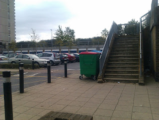
We will be zooming into the path above the car park as this is not practical from the other end which is what was planned originally (from the last picture) however it is not clear from there. 
Outside Brentford Tower Blocks
Scenes: 4

Outside Brentford Tower Blocks
Scenes: 5
Brentford Bus Stop
Scenes: 6-7
We chose these locations as it is practical for us to film there, as it is close, safe and looks like a normal neighbour hood with flats/other buildings, and other conventions/ mise en scene such as parks, pathways and scenery. This is where the first half of the flasback will take place. The filming for all these shots/scenes would have to be done on the same day around the same time because the lighting would be natural which would depend on the weather. We wouldn't be able to have it rain in one scene and not another as this would make it seem like a different day and it would not look correct/ unprofessional.
Friday 7 October 2011
Character Casting- Final
The Main Characters:
These are the actors who will be playing the main characters in the actual film- Practically Strangers.

Hallie/Girl 1: Rhian Vidler
She will look like a normal stereotypical 18 year old. This will be played by Rhian Vidler as she is near the age therefore she plays a convincing role and helps the audience to see the age of the characters actually are which already give a bit of background knowledge to the audience of their personality this would be through stereotypcial ways such as carrying a handbag/shoulder bag, wearing make up, hair out and the fact that she will be carrying roses throughout the film (as women are normally associated with flowers).
We chose Rhian because she was available to film with us as she also lives close to our filming locations. We also thought that she looks sutiable for the role as a normal British character.
*Picture of Payal*
Claire/Girl 2: Payal Jaiprakash
I will be playing the role of Hallie during Test Shoot, this was just to see what each shot looks like. The main reason for this is because there was no one available when we could film and I am also near the age of 18 which will suit the character. My hair will be out and I will carry the a handbag to make a more convincing character. Throughout the film, I will be using a prop of a card.
*Picture of Adam*
James (for the picture on the card): Adam
He will be wearing a normal school shirt (perhaps uniform) to show he is young, and the actor playing the part is also young which helps emphasise this and would help determine that the male in the film is the girl's boyfriend not husband. The way he stands in the picture with the girl will also show the audience a bit about themselves (stereotypical couple who love each other).
We thought Adam would suit this role because he looks like a normal young British student, who would also suit the main character (Hallie/Rhian). He would also be available whilst we were shooting as he also lives near our filming location.
These are the actors who will be playing the main characters in the actual film- Practically Strangers.
Hallie/Girl 1: Rhian Vidler
She will look like a normal stereotypical 18 year old. This will be played by Rhian Vidler as she is near the age therefore she plays a convincing role and helps the audience to see the age of the characters actually are which already give a bit of background knowledge to the audience of their personality this would be through stereotypcial ways such as carrying a handbag/shoulder bag, wearing make up, hair out and the fact that she will be carrying roses throughout the film (as women are normally associated with flowers).
We chose Rhian because she was available to film with us as she also lives close to our filming locations. We also thought that she looks sutiable for the role as a normal British character.
*Picture of Payal*
Claire/Girl 2: Payal Jaiprakash
I will be playing the role of Hallie during Test Shoot, this was just to see what each shot looks like. The main reason for this is because there was no one available when we could film and I am also near the age of 18 which will suit the character. My hair will be out and I will carry the a handbag to make a more convincing character. Throughout the film, I will be using a prop of a card.
*Picture of Adam*
James (for the picture on the card): Adam
He will be wearing a normal school shirt (perhaps uniform) to show he is young, and the actor playing the part is also young which helps emphasise this and would help determine that the male in the film is the girl's boyfriend not husband. The way he stands in the picture with the girl will also show the audience a bit about themselves (stereotypical couple who love each other).
We thought Adam would suit this role because he looks like a normal young British student, who would also suit the main character (Hallie/Rhian). He would also be available whilst we were shooting as he also lives near our filming location.
Character Casting
Today, we have started to discuss about who we may be casting in our short film. The first obstacle that we faced was scheduling. We found that because of the time that we have been given for the shoot, it may be harder to obtain the permission of people that we had first thought that we would want to cast. So, we are currently battling through the process of we should cast ourselves or try and find actors. We have decided that we will cast ourselves for the duration of the cinematography planning (test shoot). Until we can find actors that we deem suitable for the characters that we have created.
Finally, the most challenging obstacle we were faced with, was the casting of 'James', the dead character in our story. Although, we only need a picture of him and one of the main characters, Claire, we found that we do not know anyone of the suitable age of that which will fit the age of James'.
Finally, the most challenging obstacle we were faced with, was the casting of 'James', the dead character in our story. Although, we only need a picture of him and one of the main characters, Claire, we found that we do not know anyone of the suitable age of that which will fit the age of James'.
Animatic
I chose to do an animatic as it will helps us to understand how we can use editing in our film. I think that it helps with the length that we need to each shot and when it comes to filming. Also I am going to add the voiceover from the script which will help us to know exactly what we have to record and how it will work with each shot. Which will then help to know whether we need to add shot or take them out.
Animatic (Animation Version)
I created the animatic through Adobe Flash Professional. This is a moving version of the storyboard through an animatic.
The shots are indicated in the left hand corner of each picture.
(Please click on the picture to see the animation)


This helped us to see how the film would look through moving images.
Tuesday 4 October 2011
Storyboard- First Draft
This is the first draft of our storyboard for our short film- Practically Strangers:
Note: Girl 1 is Hallie
Girl 2 is Claire
Boy is James
Page 1

Page 2
 Page 3

Page 4

Page 5
 Page 6

Page 7

Page 8

This is the first draft of the storyboard with the different shots. We mainly use a voice-over throughout the film apart from some on set dialogues. This is because we would not be able to hear the dialogue because of various sounds in the background such as the transport at the bus stop.
A difficult shot will be the point of view shot as the roses will have to be in view therefore the camera has to be directly behind the character.
Another difficult shot would be getting of the bus and walking in different directions as there could be other people getting off the bus as well so we may not get a clear shot.
This storyboard would be suitable for our film because it shows all the main shows that will be needed although there could be a few more added such as more close ups to show expressions.
The first shots of Girl 1 walking shows her journey beginning as we see her going to the grave.
We did not put any shots in a bus as this would be hard to film as there would be other people in the bus and they would be looking at the camera.
Note: Girl 1 is Hallie
Girl 2 is Claire
Boy is James
Page 1

Page 2


Page 4

Page 5


Page 7

Page 8

This is the first draft of the storyboard with the different shots. We mainly use a voice-over throughout the film apart from some on set dialogues. This is because we would not be able to hear the dialogue because of various sounds in the background such as the transport at the bus stop.
A difficult shot will be the point of view shot as the roses will have to be in view therefore the camera has to be directly behind the character.
Another difficult shot would be getting of the bus and walking in different directions as there could be other people getting off the bus as well so we may not get a clear shot.
This storyboard would be suitable for our film because it shows all the main shows that will be needed although there could be a few more added such as more close ups to show expressions.
The first shots of Girl 1 walking shows her journey beginning as we see her going to the grave.
We did not put any shots in a bus as this would be hard to film as there would be other people in the bus and they would be looking at the camera.
Subscribe to:
Posts (Atom)